Monday, April 27, 2009

Calligraphic Art Show in May


Our guild is having an Exhibit!
MAY 1-22, 2009
M-F 9-9, Sat 9-6,Sun 1-5, closed Victoria Day, May18
Stanley Milner Library
102 Ave & 99 St. Edmonton
Members of ECS will be demonstarting & having exciting items for sale on Sundays from 1-5
Please Come!

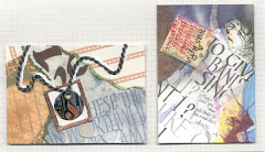
Edmonton Calligraphic Society offered their free fun day for members which I took in, and our 1st project was to decorate these canvas Pen & Brush Holders. Was that EVER fun!

Jackie Doll sewed each one of these up ahead of time for us (thank you, Jackie...mine alone would've taken me all day) and all we had to do was throw the paint on!
We used liquid acrylics; Dr.Martin's worked the best for lettering with nibs, and I used cheapie folk art acrylics for most of the rest, along with the flourish stamps from Quietfire Designs, ttp://www.quietfiredesign.com/
stamped onto the same paint, which we mixed & spread out on yogurt lids.
It was SO exciting!
Now I must finish our 2nd project, which was a decorated storage cube made from CD Cases.
This is a view of the back of the penholder.


Friday, March 27, 2009

Here's to SISTERS! and unfinished projects


Yep, it's finally done. My 1st and probably last fabric piece. You know, the one I blogged about a year or 2 back? I handed "SISTERS" over to my big (wh0's getting smaller by the week) sis for her recovery period, so that must mean it really is finished, although now while resizing the pics I see there's an area across the bottom that could use something...maybe very light in color as the eye needs a place to rest. I've got it; that whole canvas at the bottom could be fringed. What do you think?


I also forgot to add the poem's author, so that I could write just above the blue cord.
Remember this original, before I decided to write the complete lyrics? I know, too bad I covered it all up. Thanks again to Lisa Engelbrecht of California who taught this to the Edmonton Calligraphic Society http://edmontoncalligraphicsociety.ca/
Yay Sharon, for getting rid of all the crap & seriously tackling that awful *!x#*!!#xx** word. (EXERCISE)
Personally, I think I'll just down another couple Tylenol 4's before I step out to pick up the mail... it seems to be working quite well these days.

Wednesday, February 4, 2009

A Wedding Project

My cousin Danielle & Greg wanted their wedding stationery to
somehow incorporate the season without being too Christmassy. In Toronto there could be snow on the ground or still remnants of the colorful autumn leaves. Their colors were plum purple, bronze, green and brown. I did the lettering and artwork, emailed it to them, and they took care of the paper choice, printing & assembly.
After a couple attempts it finally came to me that with 3 D's and 2G's to their names a monogram could work as a decorative feature. The illustrations are a nod to the season as well as the fact that Greg owns his own landscaping company.
They had a rubber stamp made of the monogram which they thermal embossed for the invitation cover and reduced above the date on the back of their ceremonial program. Now they'll be able to use their stamp on Thank-You cards or whatever they choose.
Congratulations cousins!

Card & Envelope folds


I love the way
Margaret Poznansky used photos her father took of her as a child in an accordion fold card. It's 1 long sheet; you see 2 images 'cause it was too long for the scanner. A few strokes of a pointed pen nib (allows pressure for more weight in the lines) create a playful border. The last section on the end has been scored twice to allow for the width of the card. With that folded over like a cover all that was needed was a small red ribbon tied around to add a splash of color.


Sonja Idema comes up with the most innovative ideas. Isn't this cool how she used a much larger envelope for her tag-like greeting card; here's the front, inside view and the tag itself.


Thursday, January 15, 2009

'Tis Still The Season if our tree's still up

Here are a few more lovely hand-made cards I received from fellow calligraphers.


"A multitude of...happiness" with gold dots accenting the bright red compressed italic was a lovely surprise from Thea Paul, a Bow Valley Calligraphy Guild member from Calgary.
http://www.bvcg.ca/


Gail Fournier's beautiful watercolour opens to a quote written in walnut ink in the Uncial style, which looks to be laser printed.
Both of these first 2 cards are from enthusiastic newbies...."young" calligraphers with less than 5 years of lettering behind them.
Exposure to all a guild has to offer...quarterly newsletters, knowledgeable instructors, seeing the lettering & projects of others up close, patience and a willingness to get involved have all made a difference towards the growth of these 2 ladies.


Bev Paranych has a magic touch with her Gocco machine;
she always gets good results from this small silkscreen hand printer. Her tree shaped lettering is framed by triangular cutouts with fine sparkly filligreed material behind. Or is that 2 layers of cloth...one has raised gold stars. Bev's been doing calligraphy for eons, and it shows in the smooth flow of her lettering. I have yet to figure out how she manages to put the hours it takes into the detailing of her Christmas cards, work 2 jobs outside the home, run a household and renovate, all at the same time.
(Slightly green with envy there.)


Bev gained most of her experience while a member of the
Northern Lights Calligraphers,
P.O. Box 6220.
Fort McMurray,
Alberta
T9H 4W1
Canada

Thursday, January 8, 2009

'tis still the Season

right? I didn't mail-out any greetings this year but sure received some beautiful cards in return.
This one from Diane Waters is for all the ECS members. I've always wanted to do a card with greetings from around the world. Her greetings in foundational lettering are offset by the country of that language in a fine monoline which creates a nice texture. The bow attaches an overlay of vellum on which she added a personal message.


Cindy's Green's watercolours are looking so professional. It's that kind of day here today, and I just have to share.


I love the way Peggy Marce created such a wonderfully crisp card with one color ink and 2 nib sizes. You sure get that winter feeling...


Saturday, December 13, 2008

greetings for the season


It's that time of year...less than 2 weeks til Christmas when the quote gets down-sized to just one word to calligraph, and the hand made cards get reduced to bookmarks (no inner message necessary), THEN the bookmarks with fancy yarn become bookmarks with just a fold over top. This year the Christmas greetings will become "seasonal" as in sometime this winter for those on the mailing list, and I shall enjoy a relaxing guilt-free time doing puzzles with the yule logs burning in the fireplace...real logs really burning; none of that energy efficient fake crap here. Well, we did replace all the Christmas lights with LED's. And for the 2nd year in a row have not bought any new Christmas wrap or bows. But we're thinking we might put up the fake tree with the fake lights today, with only 1/2 the month left that'll cut down on the energy draw!
(Oh, and that one word? I did spend 2 days on it, haha!
Thank you Thomas Hoyer, for the flourishing class.)
I do hope you enjoy YOUR winter season, and if you don't get to spend it with loved ones, remember them in that special place in your heart!

Friday, November 28, 2008

Crazy calligrapher...I mean calligraPHY

I'm back! Ok, not sure WHERE I went, but it wasn't all that much fun.
The Art Muse LEFT the building, even if I didn't. Literally, my other 1/2's car tranny cratered so he's been using my car. Hate being housebound, but on the positive side, 'cause I dislike going out after supper anyway, HE had to get groceries on his way home!

Unfortunately, because of other circumstances, I also had to cancel the Kersals course I was supposed to teach in Edmonton this month. I am sorry about that. Calligraphers are an especially forgiving species, thank you!


ART STUFF; I actually entered & remained in the studio today AND finished this wedding piece.
For something totally different, I used my new Pan Pastels
(Thanks for the birthday gift, Mom!) and did all the outlining with a bright copper gel pen. With pan pastels you need to use a fine pointy sponge to tap the color on. Check out
http://www.panpastel.com/

The monoline names at the bottom are 4 mm tall (less than 1/4") so you can imagine my frustrationkeepingthecoloroutsidetheletters but withinthehorizontallines.
Then tried erasing the pastel that went over the lines & inside counterspaces. After an hour getting nowhere I thought "Why don't I try out that eraser shield that came with the Ames Lettering Guide I got 35 years ago?"

It's a small piece of thin tin with a bunch of different shapes cut out. Draftspeople use it for erasing lead pencil marks. Layed the shield on the paper with the open shape on top of whatever tiny similar shaped area needed erasing, then wiggled or patted a kneaded eraser on the opening. Keep kneading the eraser & the color disappears. See all the size possibilities? Works like a dam_!


So the J & S are a little wild, but my cousin that got married is in her late 30's, so she must have a sense of humour, right? And they've been together for a while, so it's not like she's desperate.
You can click on the pictures to enlarge them, Mom.

Saturday, October 18, 2008

Kersals from Kids


Check this out.
These are samples from a youth group. Various ages; I believe 12 & up.
ECS member Gail, a retired teacher & student of mine, taught them a pared down version of Kersals over a period of just a few hours. (After checking with me for permission; Thanks, Gail.) Gail showed them a few basics then just let them go at it.

Kids are so amazingly creative.
They don't hold back.
They don't show fear.

I think
we have to
remind ourselves sometimes that when taking a workshop:

Not to expect perfection from ourselves. The classroom is an unusual setting & we won't create as we might in a quieter, more comfortable setting.

Why worry that our classwork isn't up to par with others (or even what we perceive others expectations of our work should be)? The stages we're at in our calligraphic journey are distinctly unique to US.

We all learn in different ways; "it" may come to us when we take time to review and if it's a letter style, it will definitely require practise.

    Take notes if you need to in class, but really when the situation calls for it (this is ART, after all) just let go and have fun.
    Explore. Experiment. See what happens. Be a kid again!
    (Now that's definitely a lesson I need to remind myself!)
    I'll be teaching Kersals again for ECS on Nov.8 & 9th. It's been a while so expect some changes & be prepared to play!
    p.s. The Edmonton Calligraphic Website is temporarily under...undergoing a change of servers, if that makes any sense...or something.

Tuesday, October 14, 2008

Monogram for Wedding

Here's a wedding monogram I did with the initials of the bride & groom. The original was quite large, lettered in black ink on Pentalic Paper For Pens, an extremely smooth bright white paper ideal for reproduction; the initials lettered with a large brass tool; 1/4" Techniquill. After playing with flourishes using a pencil and layers of tracing paper over the monogram until finding something that worked, I inked the flourishes onto the
original using a Pointed Pen Nib. I found by turning the paper I was able to create the thicker swells in a greater variety of places.

Having taken Thomas Hoyer's class on flourishing since then, I can now see 3 areas that could be improved. Can you find them?

Wednesday, September 17, 2008

Tribute to Bronwyn

There's something special about a young man just entering University who feels the need to share his life with a young pup. Chris is now my brother-in-law, and his family grew to include my sis Cathie, then shortly after, 2 lively little girls and another yellow lab. Chris' faithful companion recently left this earth. Bronwyn was an exceptional lady; quiet yet friendly, patient and content, as seen below on a 2 1/2" x 3 1/2" ATC I created for an exchange.

I doctored the photo of my niece and Bronwyn in "Nero"; added the Groucho Marx quote with a flexible pointed pen nib, then I made color copies. An extremely reduced calligraphic Christmas letter creates a 3-D book. The 6 pages, glued accordion style, are just 1/4" tall, but they do turn...had to see if it could be done. The plaid ribbon is a nod to my brother-in-law's tartan and kilt and along with the star brad add a bit more dimension.

Bronwyn quietly put up with the chaos her household became; being used here as a cushion for the 2 year old, who was reading one of her books in the original photo. The photo of Bronwyn & her human family was taken on her last day. She'll be missed, but as my now 5 year old niece says "It's OK; she's still here" as she points to her heart.

Tuesday, August 12, 2008

Make multiple cards in a hurry

I could spend a full day creating a card! Sometimes that's not the best use of my time, so instead I might throw a whack of stuff on a large sheet of card stock (which you can buy from your local friendly printer but not just any copy shop) then chop it up & glue the pieces on. I keep a stack of 8 1/2 x 11 card stock handy ready to cut in half for 2 cards; folded to 4 1/4" x 5 1/2".

This started as a 22"x35" blank sheet. I initialy worked on top of this paper while creating other cards. All the turquoise images are from the stamps I used on Sheri & Ian's card. (See previous posting below) Why waste all that nice ink? Here's the how-to:
  1. Stamp your stamps clean on large sheet of cover weight card stock.
  2. Scatter written words throughout; I used ruling pen & brown walnut ink for lettering large-they're pretty forgiving. Try sprinkling a metallic powder like Schminke over small areas of still-wet ink. A hint from Lisa Engelbrecht is to cover the jar opening with nylon pantyhose, wrap elastic band to hold in place. This ensures you'll get a sprinkle of powder, not a clump. You can still put the lid on when you're done if the elastic's far enough down.
  3. Overlap multiple stamps using various colors dye or pigment stamp ink. I just love Suzanne Cannon's new flourish stamps @ http://www.quietfiredesign.ca/. Tiny curlicues make great fillins.
Now it's just a matter of cutting the sheet into smaller pieces & using them as the focal point on plain card stock. Double-sided adhesive tape works well.
Suzanne also has instructions to make the frame cards, which are really cool because you can see your message through the window, which takes care of "Now...what should I do on the inside". Here are the instruction for making window frame cards: http://www.quietfiredesign.com/Galleries/Projects/PinnedBackFlapsKristy.htm

Get your card layouts galore

There are days when you realize you need to make a card TODAY!...and you're just not in the mood to play (horrors).....where to start?

I stumbled on this site where you can get a new lay-out each week; what a great idea! check it out at
http://janellerichmond.typepad.com/sketchthis/

You'll also find the creations of others, using that particular lay-out, if you have time to browse. And there's http://janellerichmond.typepad.com/photos/sketchthis_layout_sketche/index.html

if you prefer to have all your layout choices "lay"ed out before you.
OK, I'm no longer stumped!

Tuesday, August 5, 2008

Calligraphy dust

After all that blogging, unloading the trailer from a weekend Antique Car Tour in the Rocky Mountain House area, hanging sleeping bags out to air & finishing a birthday card for Laurie who's (ahemmm) 39 she says, it looks like the house could use a bit of dusting. I say a bit, cause a lot would be too overwhelming, so why even bother to start.

Could this be why the boys have allergies?
Well, can't say I never gave them anything!

Sheri & Ian's wedding

I love how Sheri & Ian sent luggage tags as their Save The Date notices. Doesn't this just make you wanna hop on a plane & get out there, NOW? I know it's going to be fun. Their invitation is just as cute, with a Lemony Snicket phrase on the front


"One of the remarkable things about love is that despite very irritating people writing poems and songs about how pleasant it is... it really is quite pleasant".


I used this and their chosen colors as the basis for their wedding gift, which is on 8x10 Arches wc paper. That quote was written with Sakura Glaze pen, their names with ruling pen & walnut ink with metallic added later which actually came out a little 3-D so I was happy about that.


I was going for the whole "Let's not make this another nice flat piece with some nice flat writing on it... let's see some depth & pizazz to it!" The brown ribbon, copper sticky-backed tape (from my stained glass TRIAL period 29 years ago...when I tried to halve a full sheet of glass, which ended when I crawled up from the basement & drove my pregnant self in my little green Honda to the Foothills Hospital for stitches on 3 fingers).


Oh yeah, found the raised embossed love hidden in my paper files and stuck on some thread, plastic sticky-backed squares & little stars and with pointed pen wrote the Elizabeth Barrett Browning quote
"I love you not for what you are...but for what I am when I am with you".

I think they'll like it.

Love on the eighth


I thought June was the month for weddings, but in my studio it's carried on into July and August.
On the left is a card for Sheri & Ian, whose wedding date will be 08-08-08!
I created the word LOVE in Kersals and photocopied it on various white papers. This particular one is 80lb Silk Text. Then I took watercolor pencils and water to it to add a little color, cut the word out, glued the back with a glue stick, and used the rubber roller to smooth it onto the card. Then used a pointed nib & ink to finish the flourishes & write their names.


The vellum envelope is shown with then without the card inside. The envelope is decorated primarily with my own carved letter stamps. The smallest lettering for their street and city are stamps I bought at Michaels-$1.50 for each alphabet! In the bin near the cashiers.
They're so cute!
the stamps, not the bins, or the cashiers.


Happy day, Sheri & Ian!

Sunday, July 20, 2008

Thomas Hoyer ruled Edmonton


Thomas Hoyer is a graphic artist calligrapher from Germany who spent about a month teaching in Alberta.
The Edmonton Calligraphic Society http://www.edmontoncalligraphicsociety.org had him teach Flourishing, Beautiful Watercolor Letters and two full days of Ruling Pens Beyond the Rules.
Super nice guy who generously allowed us to use all of his handouts and in-class demowork for our newsletter.
He likes to use the Haff ruling pen with Ecoline liquid watercolours.
These are all samples he whipped off!
He wrote each of our names up and here's a picture of him with a piece he did for us to raffle at the June Social.
I LOVE THE RULING PEN! ... and Thomas! Check out his site; he creates lettering for wedding bands, logos, tatoos, walls, objects, even carves letters. http://www.callitype.de/en/index.html