Showing posts with label Art. Show all posts

Wednesday, February 9, 2011

HAPPY VALENTINE'S DAY! & divvy it up

or "How to use up your scraps of fancy papers"

We were given a project to create for February's meeting of ECS (Edmonton Calligraphic Society) which was to create a box with 9 letters. The sample shown was

VAL

ENT

INE

however that's not something I'd have on my wall year-round. Well I could, but people would think I was weird. Which I am, but that's another story. So I opted for 'luving you'. What can I say, it was a dry day for ideas, & I had to go to a friend for that. This is how it was created:

Start with a (8"wooden) square block. (see below for how to divide an unequal measurement into equal pieces) Using clear matte medium as a paste, wrap a piece of rice paper on the front & around to the back. Paint black cheapo liquid acrylic on front & sides as a base. (Or you could just use black gesso.) Pull out all those fancy gold & red papers you've been saving for the perfect project, this is it! Then cut background squares & letters, & glue them on, alternating the color for each of the 9 squares. (Yes! the gold cross-stitch paper I saved from the 90's!) The fatter the letters, the better. Some may need a little oomph, like my U, N & Y, so outline them or the background with black pen, Gold Krylon paint or gold highlighter. Fun stuff.

Not so much fun putting all the papers away.

You can see the other samples at ECS's Facebook page. I think this is the link: http://www.facebook.com/home.php#!/group.php?gid=151228041582552

I may put the others up here after they've come out in the next guild newsletter.

Now, HOW TO DIVIDE INTO EQUAL PIECES WITHOUT A CALCULATOR
For example this green paper is 5 1/2" square & you want to divide it into 3 equal strips.
Hold the beginning of the ruler (0") against the top left corner of the paper. Find a number larger than the length of the paper that is divisible by 3; that's 6.
#1. Slide the right side of the ruler down until the 6" mark is flush with the paper edge.
6 % 3 is 2, so make a dot on the paper every 2"; at the 2" & the 4" spot.
#2. Slide the ruler down & line up the start of the ruler with the bottom left corner.
Slide the right side of the ruler to the 6" spot. Again, mark a dot at 2" and 4" .
#3. Join the upper & lower dots. To divide this page into 9 equal squares, turn the paper 1/4 turn & repeat the process.

Wednesday, January 13, 2010

A MAGICAL bookmaking structure & experience!


Spend only 6 minutes watching this amazing video as the books are discovered and opened. (Sweet musical accompaniment as well. F)

http://vimeo.com/7694315
For those of you who are interested in bookmaking, here's a wonderfully made video that displays Patience, the puzzle-like work of paper artist, Randi Parkhurst of the Pacific Northwest. I found it mesmerizing to watch how each book fits perfectly into place.
It's even more impressive when you keep in mind that Randi made all of the individual papers that compose each book.

http://www.parkhurstpaperarts.com/
Thanks to Margaret L. for the heads up & write-up on this one.
Isn't it cool?

Friday, November 9, 2007

Monday presentation YOU"RE INVITED!


Ros
& Francie's
night out

Monday, Nov.12 7-9:30
Church of Christ basement
114 St & 61 Ave. Edmonton
On Monday, Nov.12,
Ros & I will be giving a presentation about our trip to Island Magic, the International Calligraphy Conference that was held at Shawnigan Lake School on Vancouver Island this summer, to anyone who is interested (mostly Edmonton Calligraphic society members). There were 320 calligraphers there from 18 countries (I read that somewhere)You would not believe the site...about 300 acres of antique-y looking Hogwarts type buildings, lots of gardens, a couple ponds and even a house for the gnomes! We'll have lots of pics as a slide show; about 20 from the Instructors Exhibit (they're all International Superstars!), a whole wack of exciting pieces that students in our & other classes created (like Christmas candy for the eyes) and of course quite a few pics to help explain the process we went through trying to learn how to
"Develop Expression In Calligraphy".
Oh yeah, we'll even have a few pictures of Denis Brown's work.
And our sheets from the class.

And refreshments!

Hope to see you there! RSVP Ros or I


How to find the Church:If you went straight West on 63 Ave (that's Argyll) instead of following the curve past the School for the Deaf, you'd end up beside the Church, which is on the Avenue, N side of the street.


Check out http://www.islandmagic2007.ca/ >class grid
for samples of instructors work & what they taught.

Friday, October 19, 2007

More from Island Magic conference

"Developing Expression in Calligraphy" was just that...The normal upright Roman & Italic alphabets distorted; condensed, oblique, twist upward, fit into rectangular, parallelogram, trapezoid shapes, to bring movement & energy.
TOP: Instructor Denis Brown's in-class example of lettering and the spacing between & within letters was done quickly and with borrowed tools.
There was such creativity in our class!
PIECE with 3 dark areas and
TAKE STRANDS by Suzie Beringer

LEFT
wonderfully shaped letters by Susan Richardson


Also by Suzie Beringer, prolific and precise!
You really need to click on these to enlarge & appreciate them.


The rhythm of calligraphy
Mono-rhythmic has equal positive and negative spaces. Duo or Polyrhythm are more organic and add excitement, and some options to break the rhythm are counter-filled “a & o’s”, elongated ascenders & descenders, thicks & thins, extended strokes and harmony of direction and proportion.

Sunday, October 7, 2007

Happy Thanksgiving & Halowe'en Everyone!

OK, the art is not exactly "Thanksgiving " looking, but it is time to clean the crap out so those creepy crawlies don't find a place to overwinter! Now I'm outta here- it's a balmy 18C & time to clean up the outdoor patio pots!


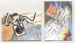
My Artist Trading Card for the ECS exchange,3.5"x2.5" Background-Black FW Acrylic Ink on Tobacco Mi-Tientes card stock. Fly-traced from wrapping paper with Pitt artist pen, colored with Sakura Glaze pens; Wings-Winsor Newton Liquid Iridescent, Eyes-Iridescent Pearl Paint Dimensional Fabric & Craft Paint pen. Ribbon-Textured stuff found when cleaning out my Mom's house. Lettering-orange Permapaque marker & Black Pitt artist pen. Other eyes are iridescent green beads.


EASY PAINT SPLATTER BACKGROUND
For 10 ATC's start with an 8.5"x11" sheet of card stock. Using a pipette, drip black ink across card stock. Blow through a straw held perpendicular .5" above an ink drop & the ink will splatter.
FOR VARIETY:
-vary the size of ink drops & space between
-hold straw at an angle then blow
-vary direction of straw
-wiggle straw while blowing
-exchange ink for watercolor or other liquid media
TEMPLATE to cut 10 ATC's from 8.5"x11"
Measure carefully, & draw the lines on tracing paper, then run clear tape around the edge of the sheet to protect it. Now you can play with which direction will be most pleasing before you cut the actual card stock into 3.5"x2.5" cards which you can then continue to decorate.

Friday, September 28, 2007

Art college revisited

Last year we had a little reunion at ACA(D).
Crazy fun.

Except the building looks bland & washed out. They got rid of the best part of the 70's, which was the huge main hall leading down the steps to the cafeteria, & added boxy white rooms instead. Bleccchh!

Luckily, we found that the stairwells held out some hope of creativity!


The best part?
Reconnecting with Bo & Lea.
Bo still has that funny laugh, Lea still sounds so laid back,
I'm not the only crazy one,
and now we can all feel ancient together.