
Some days you just can't get it right. Here's a piece I'm working on, BEEN working on, hard at it for a "few" WEEKS now. There is a deadline.
Fantastic poem-all women should read it!
Phenomenal Woman by Maya Angelou.
That's
PhenomENal WomAn,
not womEn
or phenomally,
which I don't think is a word. And it better end up reading
"I'm a woman. Phenomenally. Phenomenal woman. That's me."
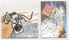
It's 100 lines long (OK, it's only 52). Client wants 3 copies (plus 1 for me, for next year's library show?) I CHOSE to lay it out with multi styles and sizes of lettering and spacing; it needs to be EXCITING! FORCEFUL! which also means there's multi sized guidelines in SO MANY uneven places that so far I've spent 3 days just lining & erasing & lining the copies, even using the Ames Lettering Guide and the light table. It's 18"x22" on Waterford Saunders HP watercolor paper (not cheap).
Mediums so far:
*Walnut ink
*watercolor pencils
*luminescent acrylic
Tools:
*Hiro Bronze pointed pen
*#3 1/2 Mitchell nib
*#2 Mitchell nib
*ruling pen
*pencils
So, this ends up being "an experimental exercise" or we could call it a rough.
Phenomally.
Whatever.


1 comment:
Why do you think something's wrong with it. On first glance, looks good to me. Although I only count about 24 lines, so where are the rest?? Interesting color scheme. I'm just wondering if the brown which I associate with the earth (and as a bottom color) is fighting with the luminescent colors (which I associtate with shine on top). The longer I look at it, I'm not sure which wants to take dominence. Even though it's very evident that the brown lettering is on top of the colored letters. I love the way you wrote "woman". That "O" says it all about women. Ignore me, I'm just rambling.
Post a Comment