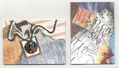
"Developing Expression in Calligraphy" was just that...The normal upright Roman & Italic alphabets distorted; condensed, oblique, twist upward, fit into rectangular, parallelogram, trapezoid shapes, to bring movement & energy.
TOP: Instructor Denis Brown's in-class example of lettering and the spacing between & within letters was done quickly and with borrowed tools.
PIECE with 3 dark areas and
TAKE STRANDS by Suzie Beringer

LEFT
You really need to click on these to enlarge & appreciate them.
The rhythm of calligraphy
Mono-rhythmic has equal positive and negative spaces. Duo or Polyrhythm are more organic and add excitement, and some options to break the rhythm are counter-filled “a & o’s”, elongated ascenders & descenders, thicks & thins, extended strokes and harmony of direction and proportion.


3 comments:
Hi Francie...thanks for the nice comment, love the work you are showing from Island Magic! Lorraine
Enjoyed your slide show Francie. Thanks for letting me know about it.
Val
Post a Comment