 Maya Angelou Poem
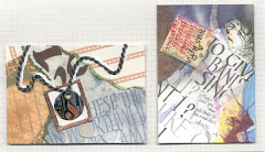
These are the pieces I completed last month for a client; primarily Walnut ink & watercolor pencils. I was somewhat limited by the overall size and the fact that 1 or 2 will be going up in an office, so we didn't want the word "breasts" to stand out although when you have them, you want them to, right? rather than stand in or sit down...
Photos aren't great; I'd pinned the pieces to the bulletin board where I now hang my in-progress work, so each time I enter the studio I'll glance at it and maybe something will pop out or up or in...to the brain.
There are slight changes from one to the next. The metallic on the O's came about due to the star. Why the star in just one? To cover a smudge. Call it a happy accident. 

Now, would you add a star to the others?
Those O's are a combination of products over the walnut ink. Top-blue FW Liquid Acrylics with Schmincke Aluminium powder, Winsor & Newton Irridescent Medium, Createx Chameleon Airbrush Colors (love em-super bright & shiny) in Green. Center- Irridesc medium & Chameleon Lilac. Bottom-LuminArte Gold Dust and Winsor & Newton Gold Calligraphy Ink.

Are there any changes YOU'D make? Lettering dynamics, layout adjustments? PLEASE add your suggestions, 'cause there's another I've yet to finish  for myself.
 for myself.
I'm happy with them although the 'W' in woman really bugs me now (it didn't while they were still here); it could be the same size as the 'man'. I might try Gouache for the verses and yikes! that Italic is pretty shabby. Running a brush of Gouache over the nib will create a slower rhythm; should help maintain better letterforms. But overall I'm good with it...maybe some barely visible tiny Yves Leterme-like script with "I'm a woman, phenomenally. Phenomenal woman. That's me." after each verse. We'll see.
Have you tried this for display? If you stick a couple pieces of tape to the top back of and poking above the watercolor paper, then fold the tape over on itself to create a tab you can stick a tack in just the tab-no tape or tack holes on the piece.


