
"Developing Expression in Calligraphy" was just that...The normal upright Roman & Italic alphabets distorted; condensed, oblique, twist upward, fit into rectangular, parallelogram, trapezoid shapes, to bring movement & energy.
TOP: Instructor Denis Brown's in-class example of lettering and the spacing between & within letters was done quickly and with borrowed tools.

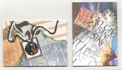
There was such creativity in our class!

PIECE with 3 dark areas and
TAKE STRANDS by Suzie Beringer

LEFT
wonderfully shaped letters by Susan Richardson

Also by Suzie Beringer, prolific and precise!

Also by Suzie Beringer, prolific and precise!
You really need to click on these to enlarge & appreciate them.
The rhythm of calligraphy
Mono-rhythmic has equal positive and negative spaces. Duo or Polyrhythm are more organic and add excitement, and some options to break the rhythm are counter-filled “a & o’s”, elongated ascenders & descenders, thicks & thins, extended strokes and harmony of direction and proportion.


