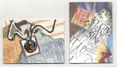
There are days when you realize you need to make a card TODAY!...and you're just not in the mood to play (horrors).....where to start?
I stumbled on this site where you can get a new lay-out each week; what a great idea! check it out at
http://janellerichmond.typepad.com/sketchthis/
You'll also find the creations of others, using that particular lay-out, if you have time to browse. And there's http://janellerichmond.typepad.com/photos/sketchthis_layout_sketche/index.html
if you prefer to have all your layout choices "lay"ed out before you.
OK, I'm no longer stumped!
Tuesday, August 12, 2008


Tuesday, August 5, 2008
Calligraphy dust
 After all that blogging, unloading the trailer from a weekend Antique Car Tour in the Rocky Mountain House area, hanging sleeping bags out to air & finishing a birthday card for Laurie who's (ahemmm) 39 she says, it looks like the house could use a bit of dusting. I say a bit, cause a lot would be too overwhelming, so why even bother to start.
Could this be why the boys have allergies?
Well, can't say I never gave them anything!
Sheri & Ian's wedding
 I love how Sheri & Ian sent luggage tags as their Save The Date notices. Doesn't this just make you wanna hop on a plane & get out there, NOW? I know it's going to be fun. Their invitation is just as cute, with a Lemony Snicket phrase on the front
"One of the remarkable things about love is that despite very irritating people writing poems and songs about how pleasant it is... it really is quite pleasant".
I used this and their chosen colors as the basis for their wedding gift, which is on 8x10 Arches wc paper. That quote was written with Sakura Glaze pen, their names with ruling pen & walnut ink with metallic added later which actually came out a little 3-D so I was happy about that.
I was going for the whole "Let's not make this another nice flat piece with some nice flat writing on it... let's see some depth & pizazz to it!" The brown ribbon, copper sticky-backed tape (from my stained glass TRIAL period 29 years ago...when I tried to halve a full sheet of glass, which ended when I crawled up from the basement & drove my pregnant self in my little green Honda to the Foothills Hospital for stitches on 3 fingers).
Oh yeah, found the raised embossed love hidden in my paper files and stuck on some thread, plastic sticky-backed squares & little stars and with pointed pen wrote the Elizabeth Barrett Browning quote
"I love you not for what you are...but for what I am when I am with you".
I think they'll like it.
Love on the eighth


 I thought June was the month for weddings, but in my studio it's carried on into July and August.
 On the left is a card for Sheri & Ian, whose wedding date will be 08-08-08!
I created the word LOVE in Kersals and photocopied it on various white papers. This particular one is 80lb Silk Text. Then I took watercolor pencils and water to it to add a little color, cut the word out, glued the back with a glue stick, and used the rubber roller to smooth it onto the card. Then used a pointed nib & ink to finish the flourishes & write their names.
The vellum envelope is shown with then without the card inside. The envelope is decorated primarily with my own carved letter stamps. The smallest lettering for their street and city are stamps I bought at Michaels-$1.50 for each alphabet! In the bin near the cashiers.
They're so cute!
the stamps, not the bins, or the cashiers.
Happy day, Sheri & Ian!
Sunday, July 20, 2008
Thomas Hoyer ruled Edmonton

Thomas Hoyer is a graphic
 artist calligrapher from Germany who spent about a month teaching in Alberta.
The Edmonton Calligraphic Society http://www.edmontoncalligraphicsociety.org had him teach Flourishing, Beautiful Watercolor Letters and two full days of Ruling Pens Beyond the Rules.
Super nice guy who generously allowed us to use all of his handouts and in-class demowork for our newsletter.
He likes to use the  Haff ruling pen with Ecoline
  liquid watercolours.
 Haff ruling pen with Ecoline
  liquid watercolours.
These are all samples he whipped off!
He wrote each of our names up and here's a picture of him with a piece he did for us to raffle at the June Social.
I LOVE THE RULING PEN! ... and Thomas! Check out his site; he creates lettering for wedding bands, logos, tatoos, walls, objects, even carves letters. http://www.callitype.de/en/index.html
Thursday, July 3, 2008
Handmade sketchbook art journal
(OOPS, accidentally deleted this one from a couple years ago trying to minimize labels )
)
A personalized sketchbook/writing journal with pens for the boy (son#2) who has everything, or wants to write about it (having everything).
 The cover and pages are 17" x22" Krypton Parchment paper, which handles water nicely and folds easily. The cover is deocrated with Walnut Ink (of course), Lanaquarelle crayons, a few globs of instant coffee to ignite ALL the senses. If he ends up on the street he can just add water (... out
 comes the mother in me). When dry I folded it and decorated the visible center area some more with Derwent Inktense watercolor crayons, letter stencils and FolkArt Metallic Taupe acrylic, my handcarved stamps and Faber-Castell's Artist Pitt pens, which are India Ink and cover arylics nicely. I like that the pens are available as a brush as well as small, medium & bold and in so many earthy colors. I put a piece of sturdy cardboard between the cover layers to create a stiffer surface for drawing. The 2 signatures of 18 pages fold to 7"x5" and are attached with Linen bookbinders thread to a file folder cut to size. The holders for the pens are made from old Macleods fishing line- mulicolored from the factory in my favorite earthy colors & so old it's more like fabric rope than the newer nylon line. I braided it, knotted the loops, sewed them thru a couple layers then added Api's The Ultimate glue for good measure.
 )
)Happy birthday, kiddo!
A personalized sketchbook/writing journal with pens for the boy (son#2) who has everything, or wants to write about it (having everything).
 The cover and pages are 17" x22" Krypton Parchment paper, which handles water nicely and folds easily. The cover is deocrated with Walnut Ink (of course), Lanaquarelle crayons, a few globs of instant coffee to ignite ALL the senses. If he ends up on the street he can just add water (... out
 comes the mother in me). When dry I folded it and decorated the visible center area some more with Derwent Inktense watercolor crayons, letter stencils and FolkArt Metallic Taupe acrylic, my handcarved stamps and Faber-Castell's Artist Pitt pens, which are India Ink and cover arylics nicely. I like that the pens are available as a brush as well as small, medium & bold and in so many earthy colors. I put a piece of sturdy cardboard between the cover layers to create a stiffer surface for drawing. The 2 signatures of 18 pages fold to 7"x5" and are attached with Linen bookbinders thread to a file folder cut to size. The holders for the pens are made from old Macleods fishing line- mulicolored from the factory in my favorite earthy colors & so old it's more like fabric rope than the newer nylon line. I braided it, knotted the loops, sewed them thru a couple layers then added Api's The Ultimate glue for good measure.
Monday, June 23, 2008
3 Phenomenal Womanses
 Maya Angelou Poem
These are the pieces I completed last month for a client; primarily Walnut ink & watercolor pencils. I was somewhat limited by the overall size and the fact that 1 or 2 will be going up in an office, so we didn't want the word "breasts" to stand out although when you have them, you want them to, right? rather than stand in or sit down...
Photos aren't great; I'd pinned the pieces to the bulletin board where I now hang my in-progress work, so each time I enter the studio I'll glance at it and maybe something will pop out or up or in...to the brain.
There are slight changes from one to the next. The metallic on the O's came about due to the star. Why the star in just one? To cover a smudge. Call it a happy accident. 

Now, would you add a star to the others?
Those O's are a combination of products over the walnut ink. Top-blue FW Liquid Acrylics with Schmincke Aluminium powder, Winsor & Newton Irridescent Medium, Createx Chameleon Airbrush Colors (love em-super bright & shiny) in Green. Center- Irridesc medium & Chameleon Lilac. Bottom-LuminArte Gold Dust and Winsor & Newton Gold Calligraphy Ink.

Are there any changes YOU'D make? Lettering dynamics, layout adjustments? PLEASE add your suggestions, 'cause there's another I've yet to finish  for myself.
 for myself.
I'm happy with them although the 'W' in woman really bugs me now (it didn't while they were still here); it could be the same size as the 'man'. I might try Gouache for the verses and yikes! that Italic is pretty shabby. Running a brush of Gouache over the nib will create a slower rhythm; should help maintain better letterforms. But overall I'm good with it...maybe some barely visible tiny Yves Leterme-like script with "I'm a woman, phenomenally. Phenomenal woman. That's me." after each verse. We'll see.
Have you tried this for display? If you stick a couple pieces of tape to the top back of and poking above the watercolor paper, then fold the tape over on itself to create a tab you can stick a tack in just the tab-no tape or tack holes on the piece.
Tuesday, June 17, 2008
You call this art?
 I lied. Ive been telling people the blog is primarily art related...I've been very busy, relating to art, but as far as getting those pics up? Well, this was May; client here,Specialist appointment,Dr appt,Bank appt,Client here,Dr.appt,get 24 hour blood pressure monitor, return monitor(all that out of town),to Edmonton to buy student supplies,bus to Fort Mac to give presentation & teach Kersals (fun!),bus back 5 hours, finish 3 Phenomenal pieces, client here fro pick up-she loves em,hair appt&groceries&laundry during 2 days home, to Edmonton for 3 days of Thomas Hoyer(nice guy)from Germany(!) classes(wow!). Now INTO JUNE:create10 ATC's theme of bLING! for Edmonton Calligraphic Society Social&Silent Auction(lotsa fun)-Thomas Hoyer donated piece gets guild $70 in raffle,Dr. appt next day,visit Sam on the way home (sad...he's 80 & has emphysema;he's optimistic tho),Optomotrist appt-need new glasses (also need reading glasses now in curent frames so WooHoo! new frames!),start exercise with neighbor(Yay)in her basement gym(double yay-climb thru the fence),exercise again,another eye appt,wake up to discover 10calligraphed name place cards are due today(no spares) but forgot so fit in between exercise & another eye appt-write same name twice-wedding in 3 days,new place cards in Edmonton,fake it by cutting piece of card stock same color to fit within gold border,glue it on top, Evie from Cochrane drops by(old ECSfriend-nice),lunch with Evie&Mary(good visit),Father's Day,start card for Marv for FD(not finished but get to use Ruling writer)& Eco liquid watercolors from Hoyer class,chat to kids(always good),Gastroscopy &Botox yesterday(good-get to rest while under, plus 18 hrs no food-getting slimmer) plus Surprise! quick visit with operating room nurse Judy Langner (been 10 years-she used to be ECS member-looks exactly the same) plus visit with sis (before&after dropoff-bout time). Spend ALL of today trying to figure out insurance forms(bad idea-still brain dead). About the Botox-it's free when it's injected into your esophagus-Who's gonna see those wrinkles? Tomorrow I'm posting art pics! after I clean the studio. Oops,just remembered-I'm supposed to write the article on Hoyer's Flourishing (I think) class for the next ECS newsletter (I know). Hope I can read my notes-don't remember a thing but I KNOW I learnt a lot! If you read all this you need to get a life! Be sure to click on the studio photo to get the full effect.
Monday, May 19, 2008
Addressing 111 envelopes for wedding

Long weekend...sunny out...I may have gotten a tan from the lightable. Nice area, isn't it?
I've discovered what works best for DOING MULTIPLES; first spend 2 days creating guidelines. Not necessary, but it helps, especially when you're in a hurry. OK. For addressing envelopes,  draw guidelines in pen on tracing paper. Want perfection? Use the Ames lettering guide. Trim tracing paper so it's bottom edge lines up with the bottom edge of the envelope. Fold the bottom edge of a wide sheet of paper over about an inch. Find the sweet spot on the table, which is directly in line with your eyeballs if you were to lean over and touch the paper with your nose. Tape it to the light table. No, not your nose! Set the guidelines in the pocket and tape in place. Now you can slip your blank envelopes into this pocket & get them perfect every time. Not the lettering, that's a different story; perfect envelopes, dummy! You don't even have to tape them! Tape paper around the rest of the
 area so the light doesn't hurt your eyes.
 draw guidelines in pen on tracing paper. Want perfection? Use the Ames lettering guide. Trim tracing paper so it's bottom edge lines up with the bottom edge of the envelope. Fold the bottom edge of a wide sheet of paper over about an inch. Find the sweet spot on the table, which is directly in line with your eyeballs if you were to lean over and touch the paper with your nose. Tape it to the light table. No, not your nose! Set the guidelines in the pocket and tape in place. Now you can slip your blank envelopes into this pocket & get them perfect every time. Not the lettering, that's a different story; perfect envelopes, dummy! You don't even have to tape them! Tape paper around the rest of the
 area so the light doesn't hurt your eyes.
 PROCEDURE: Blank envelopes & response cards on the left. Ink & pen on the right. List of names standing (or sitting, but in a book stand) in front of you, with a sticky note on it placed under the name you'll be working from. Pick up blank envelope with left hand, set into pocket. With right hand pick up pen, dip into dinky dip (perfect 'cause you can't dip the nib in up to your elbow!) of ink, letter (it helps to turn the light table on), put pen down, pick up finished envelope with your right  hand, place it on your right while picking up the next blank envelope with your left hand. Works great.
 hand, place it on your right while picking up the next blank envelope with your left hand. Works great.
 If you're lettering with gouache you'll need to brush the gouache on the nib so that's a whole other deal. I always try to convince the client to go with brown so I can use walnut ink.
Monday, May 5, 2008
Star Book for Gillian
View from the top
 14 days since my last post and I'm still knee deep in
  the Phenomenal Woman pieces, hence the lack of posts. So, dug in my files and found this star book; Gillian was born a few years ago in Qatar, and I had the BEST time creating a baby book commemorating the event. A star book is basically an accordian book of 5 folds with the front & back tied together for display. They're usually 3 layers. The front outer layer (shortest) of the building silhouette, is Tyvek paper with Walnut Ink and a copper metallic rubbed in. Same with the covers. That paper is rip free; necessary for the
  tiny openings to survive repeated openings (of the book). The draft was figured out on 1/8" grid paper. The middle layer is a golden brown Thai handmade paper, but the artwork's not mine.

 14 days since my last post and I'm still knee deep in
  the Phenomenal Woman pieces, hence the lack of posts. So, dug in my files and found this star book; Gillian was born a few years ago in Qatar, and I had the BEST time creating a baby book commemorating the event. A star book is basically an accordian book of 5 folds with the front & back tied together for display. They're usually 3 layers. The front outer layer (shortest) of the building silhouette, is Tyvek paper with Walnut Ink and a copper metallic rubbed in. Same with the covers. That paper is rip free; necessary for the
  tiny openings to survive repeated openings (of the book). The draft was figured out on 1/8" grid paper. The middle layer is a golden brown Thai handmade paper, but the artwork's not mine.
I "google imaged" for camels, then "borrowed" them. They were photocopied & placed image down on the Thai paper & rubbed with oil-free nail polish remover, which  transferred the image. I wet the paper with a brush to be able to tear bits away. The back inner layer (longest) has walnut ink letters in Legende style on "marble" (looks more like clouds to me) card stock.
 transferred the image. I wet the paper with a brush to be able to tear bits away. The back inner layer (longest) has walnut ink letters in Legende style on "marble" (looks more like clouds to me) card stock.
 The whole thing stands about 6" tall.
Click on the pictures to see a larger image.Monday, April 21, 2008
What's wrong with this picture?

Some days you just can't get it right. Here's a piece I'm working on, BEEN working on, hard at it for a "few" WEEKS now. There is a deadline.
Fantastic poem-all women should read it!
Phenomenal Woman by Maya Angelou.
That's
PhenomENal WomAn,
not womEn
or phenomally,
which I don't think is a word. And it better end up reading
"I'm a woman. Phenomenally. Phenomenal woman. That's me."
It's 100 lines long (OK, it's only 52). Client wants 3 copies (plus 1 for me, for next year's library show?) I CHOSE to lay it out with multi styles and sizes of lettering and spacing; it needs to be EXCITING! FORCEFUL! which also means there's multi sized guidelines in SO MANY uneven places that so far I've spent 3 days just lining & erasing & lining the copies, even using the Ames Lettering Guide and the light table. It's 18"x22" on Waterford Saunders HP watercolor paper (not cheap).
Mediums so far:
*Walnut ink
*watercolor pencils
*luminescent acrylic
Tools:
*Hiro Bronze pointed pen
*#3 1/2 Mitchell nib
*#2 Mitchell nib
*ruling pen
*pencils
So, this ends up being "an experimental exercise" or we could call it a rough.
Phenomally.
Whatever.
Tuesday, April 8, 2008
Handmade Journal Fundraiser
 The Edmonton Calligraphic Society has a few of these beautiful journals left. They're about 8x11, selling for just $30.
covers
Members have had fun at work bees creating covers, painted pages and stitching it all together using the Coptic bound method which ensures the pages will stay flat when they're opened. Thanks to Barb Pankratz & Paullette McLaren for the idea. Barb has done most of the coptic stitching on these books as well.
Journal colophon by FAB
The colophon was particularly fun to create as there were no restrictions. A ruling pen was used to write the largest words, pointed brush for the colored lettering and pointed nib for the rest. Some of the media used were Walnut ink and liquid acrylic inks for the lettering, watercolor pencils for decorating the word "JOURNAL" and painting the word "HANDBOUND". The results for "use" are by dropping acrylic inks into wet walnut ink. When the lettering for "enjoy" was dry, a Sakura Souffle Gel Pen was used to decorate it. Click on the images for a larger view.
Sunday, March 30, 2008
The Wheatland Calligraphy Guild
 So apparently, there’s this group of 14+calligraphic friends in Melfort, Saskatchewan who get together twice a month, make cards for and with people in hospitals and assisted living homes, and travel the area to teach classes to students. They invite you out to teach a weekend class and they send a famous TV interviewer to
  pick you up at the airport (I know she’s famous ‘cause my Aunt & Uncle in Saskatoon knew of her and she’d interviewed my cousin!), she takes you to the best art supply store in Toontown "the gallery/art placement", then to her wonderfully eclectic and creatively decorated home so you can rest up a bit, a quick tour thru the back alleys, then entertains you on the 2 hour drive to Melfort.
Once they get you out there and during your first ever ‘slide’ presentation alone, they chuckle in all the appropriate places, laugh when you screw up, then feed you a banquet of fruits and mouth watering peanut butter and ginger snap homebaked (almost as good as Grandma Blanch’s) cookies.
 So you teach the course, and they feed you homemade soups and more goodies for lunch, and MAKE SURE you take all the coffee breaks in case you didn’t eat enough earlier.
Oh, and they billet you at your favorite Saskatchewan Auntie & Uncle’s place (or at least it felt like it), out on the farm, of course.
 peanut butter and ginger snap homebaked (almost as good as Grandma Blanch’s) cookies.
 So you teach the course, and they feed you homemade soups and more goodies for lunch, and MAKE SURE you take all the coffee breaks in case you didn’t eat enough earlier.
Oh, and they billet you at your favorite Saskatchewan Auntie & Uncle’s place (or at least it felt like it), out on the farm, of course.
The students were all eager learners, even allowing for the 2 sassy ladies at the back that really should have been sent to the corner...more than once. (Not!) I think I had them trained by the end of the class as they did produce some wonderful work... all under time pressured situations as well. (gotta make'em sweat, right?) 

Can you believe these 3 beautiful pieces were created in class using the same alphabet, with totally different approaches by 3 separate students? Pretty cool. Kersals Calligraphy: Gail Forsyth's F,Just As I Am Lord by Teolinda Carlson-Lang & does anyone know who's wonderfully gestural H that is?
Oh yeah, as that was the closing weekend of the Canadian Brier http://www.seasonofchampions.ca/2008brier/in Winnipeg (Curling, you know) they even arranged for my flight home to Edmonton to arrive directly after the plane carrying the grand winners, skip Kevin Martin and 2nd Marc Kennedy, who were still chatting with the media, so that I finally got to meet with and exchange hugs with Marc’s parents, my old junior & senior St.Albert High friends. We hadn't seen each other since our school days!
Oh yeah, as that was the closing weekend of the Canadian Brier http://www.seasonofchampions.ca/2008brier/in Winnipeg (Curling, you know) they even arranged for my flight home to Edmonton to arrive directly after the plane carrying the grand winners, skip Kevin Martin and 2nd Marc Kennedy, who were still chatting with the media, so that I finally got to meet with and exchange hugs with Marc’s parents, my old junior & senior St.Albert High friends. We hadn't seen each other since our school days!

That Wheatland Calligraphy Guild, they’re pretty special.
Saturday, March 1, 2008
Kahlil Gibran wedding quote

Weekend's here & it's time for an update.
Here's a piece for a wedding.
A great quote that's always in style.
Funny how, now matter how long you've been doing flourishes there's always at least a couple that really bug you?
Next time I'd create more contrast between the two letter styles on the left, too.
Always room for improvement.
Saturday, February 16, 2008
A great day for a cold & Neuland coming up
 Yes, it's cold season and I'm feeling it. Hmphh. Sniffle snort.
How can I complain though,
when I look this good!
My art college buddy Bo Kim Louie painted this wee portrait in oils. It's just 2 1/2" in diameter.
Isn't that cool?

If you want yours done too,
send me a note and I'll see
what I can do.
I'd better be well for Saturday,
Feb.23 as that's the day to teach
N E U L A N D E X P R E S S
for the
There's still room for you in it! It's gonna be fun stuff...
kinda like this and with umpteen options and variations!
It doesn't get any easier than this style.
Thursday, February 14, 2008
Happy Valentine's Month everyone!
 Yes,
Yes, this is the
2 1/2"x 3 1/2"
Artist Trading Card
created for
last years' exchange that I placed
on a pink card stock
so as to have something
cardlike & special for my loved ones,
but the message is still the same,
so we're recycling this year!
In the immortal words of KOJAK,
"Who loves ya, baby?"
I do!
Does anyone know the name of the author?
Sunday, February 10, 2008
Thea Paul's Kersal Piece
 THINK SPRING! ISN'T THIS A BEAUTY?
And to think this is an in class piece done by a student of mine makes me feel very proud of her. Thea Paul considers herself a "newer" calligrapher from the Bow Valley Calligraphy Guild, http://www.bvcg.ca/ who took Kersals when I taught it in Calgary last spring. She needed a gift that weekend and it often happens that we're able to make use of our classwork this way. Thea did a wonderful job of giving the letters a softness in fresh Spring colours. She had a second line below the name with the child's date of birth. I was totally amazed at the creativity produced in class.
I'm excited that the Wheatland Calligraphy Guild has invited me to teach Kersals in Melfort, Saskatchewan! Woohoo! They sound like a very active community group. My flight has been booked, and March 14th will be here before I know it! (I'd better get practicing.)
First up though, is a one day course for the Edmonton Calligraphic Society http://www.edmontoncalligraphicsociety.org on Feb 23. The class will be Neuland Express, a favorite for all levels and especially beginners. I'm sure to see some fun stuff happening, so must remember to take the camera!
Sunday, January 13, 2008
Monica's Swami Beyondananda
 How about a little colour out there?
I love this piece by fellow Edmonton Calligraphic Society member Monica Robertson & thought you would too. It's quite large and really draws you in to take a closer look. The quotes are by Steve Bhaerman. Monica calls it “Swami Beyondananda” and this is what she had to say about it:
"Our study group decided to explore layering for the ECS library project. I immediately went to “Swami isms” and contacted Steve Bhaerman. He very graciously endorsed the idea, i.e. no copyright infringement. I enjoyed the freedom of the layering process. (If you don’t like it, cover it up.) I began with 140 lb. w/c paper, masked off areas with masking tape, and poured, painted walnut ink and watercolor, then lettered, then collaged, then painted, then lettered."
She makes it sound SO EASY!
Tuesday, January 8, 2008
This one says Happy New Year!
 Marv surprised me last night by handing me the words Hunter and Douglas that he'd clipped from an ad. When I gave him the totally clueless look that I'm so good at, he mentioned I must be running out of names by now as I've made so many snowflakes. He might have a point, since I've even made one for the son's cat. Perhaps I'll start on spring flowers soon.
Friday, January 4, 2008
Happy New Year!
OK, took a little break there from the blog, but look what I did over Christmas!
Marv & I were off to Van to see the boy over Christmas & I needed something to do besides chew my fingernails while Marv was driving (his driving is actually pretty good & it was I who drove us into the ditch one dark blowing night on the Coquihalla) SO I made
Paper Name Snowflakes!
Lotsa fun. Did one up for all Dale's roomies in the mansion, his girlfriend and even the cat Charlie. Can you pick out the names Adrianna, Shane & Karl on the pic below?
I had a nice Happy New Year snowflake all ready to post, but the man has done something with the connections so no scan tonight.
What you need for a 6 sided snowflake is a 30 degree triangle. Cut mine from a file folder. Any photocopy paper will do for the snowflake. Vellum won't work...rubbing the fold with your fingernail causes the folded edge to become a torn edge. I also thought Tyvek would be great 'cause it doesn't tear, but it's too thick & the layers that tyvek is made with create all kinds of scratchy looking edges.
Fold a square piece of paper in half, then half again, then line up the 30 degree triangle to create 3 more folds. Draw up your name in your sketchbook 1st to decide where each letter should connect to the next. A block letter style like Neuland works great. Erase the connecting lines. After folding the paper, pencil the name on one triangular section.
Use cuticle scissors to cut out the unnecessary bits. Be sure to leave bits of paper all over the house when you get up!
You can iron your paper snowflakes to flatten them out when you're done, but if you use a steam iron, flip the snowflake over 1st or you'll get all kinds of gunk all over your nice white snowflake. The voice of experience.
All about snowflakes
http://www.its.caltech.edu/-atomic/snowcrystals/
for the most amazing photographs of real honest-to-god snowflakes like you won't believe!
For some great patterns & what to do with them once you've made them, check out http://www.papersnowflakes.com/patterns.htm
We'll be making paper name snowflakes at the January 10 meeting of the Edmonton Calligraphic Society. http://www.edmontoncalligraphicsociety.org/
Marv & I were off to Van to see the boy over Christmas & I needed something to do besides chew my fingernails while Marv was driving (his driving is actually pretty good & it was I who drove us into the ditch one dark blowing night on the Coquihalla) SO I made
Paper Name Snowflakes!

Lotsa fun. Did one up for all Dale's roomies in the mansion, his girlfriend and even the cat Charlie. Can you pick out the names Adrianna, Shane & Karl on the pic below?
I had a nice Happy New Year snowflake all ready to post, but the man has done something with the connections so no scan tonight.
What you need for a 6 sided snowflake is a 30 degree triangle. Cut mine from a file folder. Any photocopy paper will do for the snowflake. Vellum won't work...rubbing the fold with your fingernail causes the folded edge to become a torn edge. I also thought Tyvek would be great 'cause it doesn't tear, but it's too thick & the layers that tyvek is made with create all kinds of scratchy looking edges.
Fold a square piece of paper in half, then half again, then line up the 30 degree triangle to create 3 more folds. Draw up your name in your sketchbook 1st to decide where each letter should connect to the next. A block letter style like Neuland works great. Erase the connecting lines. After folding the paper, pencil the
 name on one triangular section.
Use cuticle scissors to cut out the unnecessary bits. Be sure to leave bits of paper all over the house when you get up!
You can iron your paper snowflakes to flatten them out when you're done, but if you use a steam iron, flip the snowflake over 1st or you'll get all kinds of gunk all over your nice white snowflake. The voice of experience.
All about snowflakes
http://www.its.caltech.edu/-atomic/snowcrystals/
for the most amazing photographs of real honest-to-god snowflakes like you won't believe!
For some great patterns & what to do with them once you've made them, check out http://www.papersnowflakes.com/patterns.htm
We'll be making paper name snowflakes at the January 10 meeting of the Edmonton Calligraphic Society. http://www.edmontoncalligraphicsociety.org/
Subscribe to:
Posts (Atom)