Monday, April 21, 2008

What's wrong with this picture?


Some days you just can't get it right. Here's a piece I'm working on, BEEN working on, hard at it for a "few" WEEKS now. There is a deadline.

Fantastic poem-all women should read it!
Phenomenal Woman by Maya Angelou.

That's
PhenomENal WomAn,
not womEn
or phenomally,
which I don't think is a word. And it better end up reading
"I'm a woman. Phenomenally. Phenomenal woman. That's me."

It's 100 lines long (OK, it's only 52). Client wants 3 copies (plus 1 for me, for next year's library show?) I CHOSE to lay it out with multi styles and sizes of lettering and spacing; it needs to be EXCITING! FORCEFUL! which also means there's multi sized guidelines in SO MANY uneven places that so far I've spent 3 days just lining & erasing & lining the copies, even using the Ames Lettering Guide and the light table. It's 18"x22" on Waterford Saunders HP watercolor paper (not cheap).

Mediums so far:
*Walnut ink
*watercolor pencils
*luminescent acrylic

Tools:
*Hiro Bronze pointed pen
*#3 1/2 Mitchell nib
*#2 Mitchell nib
*ruling pen
*pencils

So, this ends up being "an experimental exercise" or we could call it a rough.
Phenomally.
Whatever.

Tuesday, April 8, 2008

Handmade Journal Fundraiser

The Edmonton Calligraphic Society has a few of these beautiful journals left. They're about 8x11, selling for just $30.

covers

Members have had fun at work bees creating covers, painted pages and stitching it all together using the Coptic bound method which ensures the pages will stay flat when they're opened. Thanks to Barb Pankratz & Paullette McLaren for the idea. Barb has done most of the coptic stitching on these books as well.


Journal colophon by FAB
The colophon was particularly fun to create as there were no restrictions. A ruling pen was used to write the largest words, pointed brush for the colored lettering and pointed nib for the rest. Some of the media used were Walnut ink and liquid acrylic inks for the lettering, watercolor pencils for decorating the word "JOURNAL" and painting the word "HANDBOUND". The results for "use" are by dropping acrylic inks into wet walnut ink. When the lettering for "enjoy" was dry, a Sakura Souffle Gel Pen was used to decorate it. Click on the images for a larger view.

Sunday, March 30, 2008

The Wheatland Calligraphy Guild

So apparently, there’s this group of 14+calligraphic friends in Melfort, Saskatchewan who get together twice a month, make cards for and with people in hospitals and assisted living homes, and travel the area to teach classes to students. They invite you out to teach a weekend class and they send a famous TV interviewer to pick you up at the airport (I know she’s famous ‘cause my Aunt & Uncle in Saskatoon knew of her and she’d interviewed my cousin!), she takes you to the best art supply store in Toontown "the gallery/art placement", then to her wonderfully eclectic and creatively decorated home so you can rest up a bit, a quick tour thru the back alleys, then entertains you on the 2 hour drive to Melfort.
Once they get you out there and during your first ever ‘slide’ presentation alone, they chuckle in all the appropriate places, laugh when you screw up, then feed you a banquet of fruits and mouth watering peanut butter and ginger snap homebaked (almost as good as Grandma Blanch’s) cookies.
So you teach the course, and they feed you homemade soups and more goodies for lunch, and MAKE SURE you take all the coffee breaks in case you didn’t eat enough earlier.
Oh, and they billet you at your favorite Saskatchewan Auntie & Uncle’s place (or at least it felt like it), out on the farm, of course.
The students were all eager learners, even allowing for the 2 sassy ladies at the back that really should have been sent to the corner...more than once. (Not!) I think I had them trained by the end of the class as they did produce some wonderful work... all under time pressured situations as well. (gotta make'em sweat, right?)
Can you believe these 3 beautiful pieces were created in class using the same alphabet, with totally different approaches by 3 separate students? Pretty cool. Kersals Calligraphy: Gail Forsyth's F,Just As I Am Lord by Teolinda Carlson-Lang & does anyone know who's wonderfully gestural H that is?

Oh yeah, as that was the closing weekend of the Canadian Brier http://www.seasonofchampions.ca/2008brier/in Winnipeg (Curling, you know) they even arranged for my flight home to Edmonton to arrive directly after the plane carrying the grand winners, skip Kevin Martin and 2nd Marc Kennedy, who were still chatting with the media, so that I finally got to meet with and exchange hugs with Marc’s parents, my old junior & senior St.Albert High friends. We hadn't seen each other since our school days!

That Wheatland Calligraphy Guild, they’re pretty special.

Saturday, March 1, 2008

Kahlil Gibran wedding quote


Weekend's here & it's time for an update.
Here's a piece for a wedding.
A great quote that's always in style.
Funny how, now matter how long you've been doing flourishes there's always at least a couple that really bug you?
Next time I'd create more contrast between the two letter styles on the left, too.
Always room for improvement.

Saturday, February 16, 2008

A great day for a cold & Neuland coming up

Yes, it's cold season and I'm feeling it. Hmphh. Sniffle snort.
How can I complain though,
when I look this good!

My art college buddy Bo Kim Louie painted this wee portrait in oils. It's just 2 1/2" in diameter.
Isn't that cool?
If you want yours done too,
send me a note and I'll see
what I can do.


I'd better be well for Saturday,
Feb.23 as that's the day to teach
N E U L A N D E X P R E S S
for the
There's still room for you in it! It's gonna be fun stuff...
kinda like this and with umpteen options and variations!
It doesn't get any easier than this style.

Thursday, February 14, 2008

Happy Valentine's Month everyone!

Yes,
this is the
2 1/2"x 3 1/2"
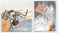
Artist Trading Card
created for
last years' exchange that I placed
on a pink card stock
so as to have something
cardlike & special for my loved ones,
but the message is still the same,
so we're recycling this year!
In the immortal words of KOJAK,
"Who loves ya, baby?"
I do!
Does anyone know the name of the author?

Sunday, February 10, 2008

Thea Paul's Kersal Piece

THINK SPRING! ISN'T THIS A BEAUTY?

And to think this is an in class piece done by a student of mine makes me feel very proud of her. Thea Paul considers herself a "newer" calligrapher from the Bow Valley Calligraphy Guild, http://www.bvcg.ca/ who took Kersals when I taught it in Calgary last spring. She needed a gift that weekend and it often happens that we're able to make use of our classwork this way. Thea did a wonderful job of giving the letters a softness in fresh Spring colours. She had a second line below the name with the child's date of birth. I was totally amazed at the creativity produced in class.

I'm excited that the Wheatland Calligraphy Guild has invited me to teach Kersals in Melfort, Saskatchewan! Woohoo! They sound like a very active community group. My flight has been booked, and March 14th will be here before I know it! (I'd better get practicing.)

First up though, is a one day course for the Edmonton Calligraphic Society http://www.edmontoncalligraphicsociety.org on Feb 23. The class will be Neuland Express, a favorite for all levels and especially beginners. I'm sure to see some fun stuff happening, so must remember to take the camera!

Sunday, January 13, 2008

Monica's Swami Beyondananda

How about a little colour out there?
I love this piece by fellow Edmonton Calligraphic Society member Monica Robertson & thought you would too. It's quite large and really draws you in to take a closer look. The quotes are by Steve Bhaerman. Monica calls it “Swami Beyondananda” and this is what she had to say about it:

"Our study group decided to explore layering for the ECS library project. I immediately went to “Swami isms” and contacted Steve Bhaerman. He very graciously endorsed the idea, i.e. no copyright infringement. I enjoyed the freedom of the layering process. (If you don’t like it, cover it up.) I began with 140 lb. w/c paper, masked off areas with masking tape, and poured, painted walnut ink and watercolor, then lettered, then collaged, then painted, then lettered."
She makes it sound SO EASY!


Tuesday, January 8, 2008

This one says Happy New Year!

Marv surprised me last night by handing me the words Hunter and Douglas that he'd clipped from an ad. When I gave him the totally clueless look that I'm so good at, he mentioned I must be running out of names by now as I've made so many snowflakes. He might have a point, since I've even made one for the son's cat. Perhaps I'll start on spring flowers soon.

Friday, January 4, 2008

Happy New Year!

OK, took a little break there from the blog, but look what I did over Christmas!
Marv & I were off to Van to see the boy over Christmas & I needed something to do besides chew my fingernails while Marv was driving (his driving is actually pretty good & it was I who drove us into the ditch one dark blowing night on the Coquihalla) SO I made
Paper Name Snowflakes!

Lotsa fun. Did one up for all Dale's roomies in the mansion, his girlfriend and even the cat Charlie.
Can you pick out the names Adrianna, Shane & Karl on the pic below?

I had a nice Happy New Year snowflake all ready to post, but the man has done something with the connections so no scan tonight.

What you need for a 6 sided snowflake is a 30 degree triangle. Cut mine from a file folder. Any photocopy paper will do for the snowflake. Vellum won't work...rubbing the fold with your fingernail causes the folded edge to become a torn edge. I also thought Tyvek would be great 'cause it doesn't tear, but it's too thick & the layers that tyvek is made with create all kinds of scratchy looking edges.

Fold a square piece of paper in half, then half again, then line up the 30 degree triangle to create 3 more folds. Draw up your name in your sketchbook 1st to decide where each letter should connect to the next. A block letter style like Neuland works great. Erase the connecting lines. After folding the paper, pencil the
name on one triangular section.
Use cuticle scissors to cut out the unnecessary bits. Be sure to leave bits of paper all over the house when you get up!

You can iron your paper snowflakes to flatten them out when you're done, but if you use a steam iron, flip the snowflake over 1st or you'll get all kinds of gunk all over your nice white snowflake. The voice of experience.

All about snowflakes
http://www.its.caltech.edu/-atomic/snowcrystals/
for the most amazing photographs of real honest-to-god snowflakes like you won't believe!

For some great patterns & what to do with them once you've made them, c
heck out http://www.papersnowflakes.com/patterns.htm

We'll be making paper name snowflakes at the January 10 meeting of the Edmonton Calligraphic Society. http://www.edmontoncalligraphicsociety.org/

Saturday, December 22, 2007

Merry Christmas!

Let us share this holiday wish of love and peace to all!

I really enjoyed creating this year's card & except for a few dollars spent at the copy shop & $ store, it's all recycled materials; using 16" strips of card stock compliments of Taylor Printing and a circular Mandala that I'd painted for an ATC exchange.

COVER: I decided to take advantage of my new Score-It-Board by making as many folds as I could (also so the card would stand up)... 80 cards, 6 fold scores each -just a couple hours. The best part? No measuring! After scoring & before folding I placed a tuna tin on each end to cut a circular shape around the edges.
The original mandala? Sketched one "pie", traced it for the remaining sections of the circle,
added color with watercolor pencils, watered it in, & outlined letters with black Sharpie marker.

TP color copied the 8" original to produce 20 (2" diameter) up on one page!, then I had a few reduced even more for the pie "peace". Glued the 2" mandala on right hand section of card stock,
between the cut circular edge & the fold, leaving 1/4" space. Cut closely around left half of the mandala so the front left cover would slide between the cut parts, which is what holds it in place when standing/closed. Pressed a 1/2" translucent colored raised adhesive-backed circle (?) to the center of the mandala to add a little shine.
Glued smaller pie "peace" to the left side.

INNER MESSAGE:
Expressive, huh? Created using a Pilot Parallel pen,
with the knowledge gained from Denis Brown's Developing Expression in Calligraphy course.
Glued peace piece on. Scanned it, placed 3 up in a Word Doc, printed, cut into 3 strips.The plan was to use our printer to print this directly onto white Unryu paper (kinda filmy, fibrous, looks handmade, also free from Kim Fjordbotten at The Paint Spot, Edmonton).
I even folded the top edge over a plain sheet 1st. Didn't work, so just used plain white copy paper.

THE ATTACHMENT: Placed inner message strip inside card stock, used tiny punch to punch 2 small holes in upper left corner, threaded $ store yarn through all & tied.
Peace out!

Saturday, December 15, 2007

Kersals by Francie


KERSALS is an alphabet created and copyrighted by Francie Alberts Bredeson


THE KERSALS COURSE
I teach consists of 12 hours of instruction over a 2 day period in a classroom setting of up to 20 students of all levels, beginners to seasoned calligraphers.

This contemporary adaptation of the centuries old Versals
is a very VERsatile alphabet that adapts well to many different
art mediums.


At this time I'm not able to offer instruction by email or snail mail, but I do travel out of province to instruct.
A Kersals Alphabet Forest.


2003

Wednesday, December 12, 2007

Kersals "Savior" Christmas card

OK, I cheated; this is from a previous year's card.
The lettering style used for "Savior" is one of my own creations.
(more later)

Saturday, December 1, 2007

Calligraphy computerized


All this by lettering just one word!
After much experimentation,
I inserted the 3 images below to a Microsoft word doc, created transparent edges, layered them, printed a copy, then scanned it to be able to add it to the blog.


I lettered the original SOAR using Walnut Ink in a 3/8" Techniquill pen, then dropped in the green Dr.Martin's Luminescent Acrylic Ink. When dry I used a metallic green gel pen to doodle around the edges.


The following are playing with it on the computer in the Nero Photosnap Image Viewer program.


Right: Emboss,
Solarize,
Find Edges

Above: Invert Colors, Remove red, Water Effect
Below: Invert Colors, Kaleidoscope

Saturday, November 17, 2007

Calligraphic exhibition

In looking for something to post this week I was reminded of some of amazing works of art that members of our guild, the Edmonton Calligraphic Society, displayed at a showing in the Stanley Milner Library. This Doris Darbasie painting is particularly exciting. Quiet and delicate, Doris is known in the Edmonton art circles as one of the finest floral watercolorists. Her Orchid paintings are particularly yummy. So where, I'm wondering, did she get the vibrant burst of energy that is this creation?

From our city, naturally.

Friday, November 9, 2007

Monday presentation YOU"RE INVITED!


Ros
& Francie's
night out

Monday, Nov.12 7-9:30
Church of Christ basement
114 St & 61 Ave. Edmonton
On Monday, Nov.12,
Ros & I will be giving a presentation about our trip to Island Magic, the International Calligraphy Conference that was held at Shawnigan Lake School on Vancouver Island this summer, to anyone who is interested (mostly Edmonton Calligraphic society members). There were 320 calligraphers there from 18 countries (I read that somewhere)You would not believe the site...about 300 acres of antique-y looking Hogwarts type buildings, lots of gardens, a couple ponds and even a house for the gnomes! We'll have lots of pics as a slide show; about 20 from the Instructors Exhibit (they're all International Superstars!), a whole wack of exciting pieces that students in our & other classes created (like Christmas candy for the eyes) and of course quite a few pics to help explain the process we went through trying to learn how to
"Develop Expression In Calligraphy".
Oh yeah, we'll even have a few pictures of Denis Brown's work.
And our sheets from the class.

And refreshments!

Hope to see you there! RSVP Ros or I


How to find the Church:If you went straight West on 63 Ave (that's Argyll) instead of following the curve past the School for the Deaf, you'd end up beside the Church, which is on the Avenue, N side of the street.


Check out http://www.islandmagic2007.ca/ >class grid
for samples of instructors work & what they taught.

Friday, October 19, 2007

More from Island Magic conference

"Developing Expression in Calligraphy" was just that...The normal upright Roman & Italic alphabets distorted; condensed, oblique, twist upward, fit into rectangular, parallelogram, trapezoid shapes, to bring movement & energy.
TOP: Instructor Denis Brown's in-class example of lettering and the spacing between & within letters was done quickly and with borrowed tools.
There was such creativity in our class!
PIECE with 3 dark areas and
TAKE STRANDS by Suzie Beringer

LEFT
wonderfully shaped letters by Susan Richardson


Also by Suzie Beringer, prolific and precise!
You really need to click on these to enlarge & appreciate them.


The rhythm of calligraphy
Mono-rhythmic has equal positive and negative spaces. Duo or Polyrhythm are more organic and add excitement, and some options to break the rhythm are counter-filled “a & o’s”, elongated ascenders & descenders, thicks & thins, extended strokes and harmony of direction and proportion.

Thursday, October 18, 2007

Baby Piece, Kersals based initials


Just finished up a piece for a friend's grand-daughter. This little 8x10 is lettered with metallic gel pens; the letter interiors are watercolor pencil. For a little pizazz I added gold thermal embossing powder, so they're raised. It's such fun to go wild with the initals to make them unique.The initials are beased on an alphabet I created called Kersals.

(Personal info deleted)

Sunday, October 7, 2007

Happy Thanksgiving & Halowe'en Everyone!

OK, the art is not exactly "Thanksgiving " looking, but it is time to clean the crap out so those creepy crawlies don't find a place to overwinter! Now I'm outta here- it's a balmy 18C & time to clean up the outdoor patio pots!


My Artist Trading Card for the ECS exchange,3.5"x2.5" Background-Black FW Acrylic Ink on Tobacco Mi-Tientes card stock. Fly-traced from wrapping paper with Pitt artist pen, colored with Sakura Glaze pens; Wings-Winsor Newton Liquid Iridescent, Eyes-Iridescent Pearl Paint Dimensional Fabric & Craft Paint pen. Ribbon-Textured stuff found when cleaning out my Mom's house. Lettering-orange Permapaque marker & Black Pitt artist pen. Other eyes are iridescent green beads.


EASY PAINT SPLATTER BACKGROUND
For 10 ATC's start with an 8.5"x11" sheet of card stock. Using a pipette, drip black ink across card stock. Blow through a straw held perpendicular .5" above an ink drop & the ink will splatter.
FOR VARIETY:
-vary the size of ink drops & space between
-hold straw at an angle then blow
-vary direction of straw
-wiggle straw while blowing
-exchange ink for watercolor or other liquid media
TEMPLATE to cut 10 ATC's from 8.5"x11"
Measure carefully, & draw the lines on tracing paper, then run clear tape around the edge of the sheet to protect it. Now you can play with which direction will be most pleasing before you cut the actual card stock into 3.5"x2.5" cards which you can then continue to decorate.

Wednesday, October 3, 2007

I've just been tagged,
which means I'm supposed to name 7 little known things about myself...

I don't think there are any.
I know how to fly.
I have a husband who keeps a pet seagull in our travel trailer.
(not a real seagull though; that'd be cruel)
I'm afraid of being homeless.
I have a childhood secret only my husband, my sister & a friend know.
I could live on popcorn & Pepsi.
I don't play tag.


Oops...it's supposed to be RANDOM things...now I have to add "don't read very well".
Happy Nadia?